
Add block
WEEK 1
Experiment 3 experiments using different methods of
translation
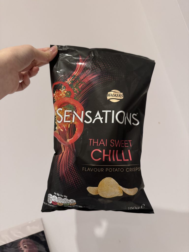
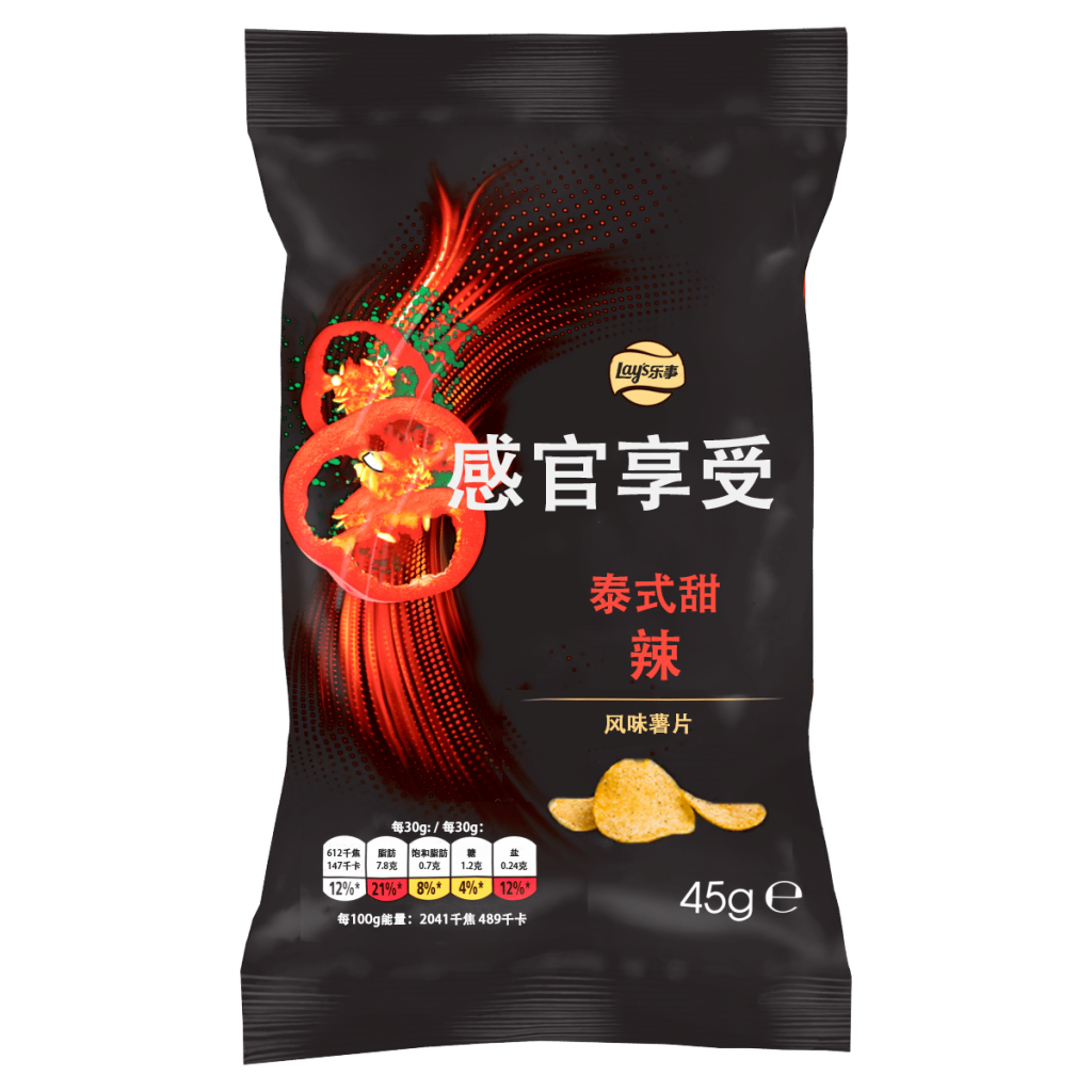
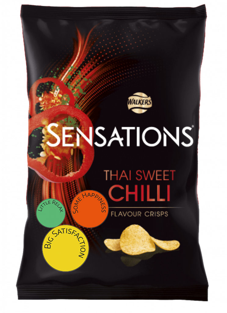
WALKERS SENSATIONS CRISPS
I chose one of my favourite chips to eat. Every time I eat it when I feel like snacking, stressed and craving, I feel satisfied and happy. So I decided to start a TRANSLATION around my emotions of eating it.
1. Translation of feelings during the eating of crisps in text.
2. Translation of the text on the packaging into Chinese.
3. Translating my feelings about this crisps in the package text.
1. Translation of feelings during the eating of crisps in text
I opened the bag of Thai Sweet Chili crisps, a little spicy kick hit the air, and my appetite kicked in right away. I grabbed the first crisp and took a bite—the crunch was amazing, and the flavor was unreal. First, there was this gentle sweetness that coated my taste buds, and then, out of nowhere, a bit of spice kicked in, just enough to wake up my senses.
With each crisp, the spice got a bit bolder, adding this cozy warmth, kind of like a quickened heartbeat. It was a little thrilling, enough to keep me reaching for more. Every bite lifted my mood, like I was on this mini flavor adventure. Sometimes the heat made me think about slowing down, but honestly, the taste was so addictive that I just kept going, feeling more and more satisfied with every crunch.
When I finished, I was totally wrapped up in the whole experience—completely content and relaxed, like I’d just had a little pocket of pure happiness.
MOOD CHANGES
Curiosity – Satisfaction – Excitement – Relaxation – Happiness
2. Translation of the text on the packaging into Chinese.
Research of Chinese market:
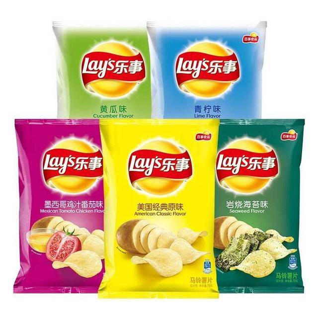
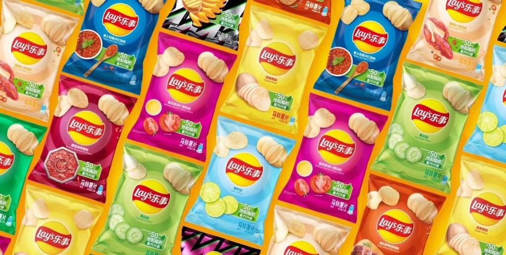
In the Chinese market walkers name logo including the product line is completely different. The main purpose is to cater to the taste of Chinese people and the Chinese market. So this flavour of crisps is not available in China, so I want to completely change the English packaging into Chinese packaging according to the Chinese market standard.

I’ve noticed that directly translating English into Chinese doesn’t look as good because the layout styles are different.
Chinese and English have different approaches to design and layout.
As a Chinese designer who studied design in the UK, I designed mainly in English when I studied and then in Chinese when I returned to China, I found that Chinese and English designs are very different because Chinese characters are characterised by one square after another, which leads to a need to make changes in typographic thinking.
3. Translating my feelings about this crisps in the package text.
My feelings are reflected in this potato crisps package. I think I can’t stop eating this chip and I’m very happy when I’m done.
WEEK 2
Research:
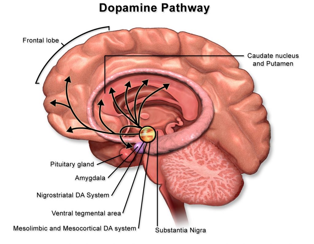
Brain Reward System:
Ingesting palatable foods, especially those high in sugar, fat, or salt, stimulates the brain’s reward pathways, leading to the release of dopamine—a neurotransmitter associated with pleasure and reinforcement.
Snacking can serve as a form of emotional eating, providing comfort during times of stress or negative emotions. This behavior is often linked to the soothing effects of certain foods, which can temporarily alleviate emotional distress.
Sugar:
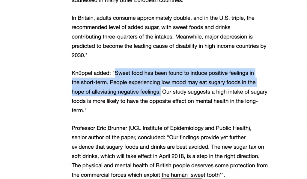
A simple carbohydrate, is quickly absorbed and converted into glucose, providing immediate energy to the brain and body. This rapid energy boost triggers dopamine release in the brain, bringing a quick sense of happiness. Its sweet taste is naturally appealing, offering a fast-acting sense of satisfaction.
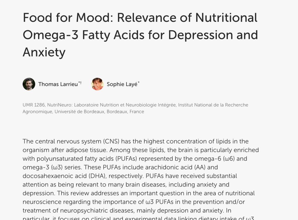
Fat:
Certain fats, particularly omega-3 fatty acids, are essential for the production and function of neurotransmitters like serotonin, which plays a key role in mood regulation. Adequate intake of these fats can support emotional stability and reduce the risk of mood disorders.
Fat is also a high-energy substance that stimulates the release of hormones like cholecystokinin, which promotes fullness and emotional comfort, resulting in satisfaction and relaxation.
Salt:
Insufficient sodium intake can adversely affect mood. Research indicates that sodium deficiency may lead to symptoms like fatigue, cognitive impairments, and decreased motivation.
The sodium ions in salt heighten taste sensitivity, enhancing the overall flavor and creating a natural sense of satisfaction and mild happiness. Salt is essential for cellular function, and our body’s craving for it can make eating salty foods especially gratifying.
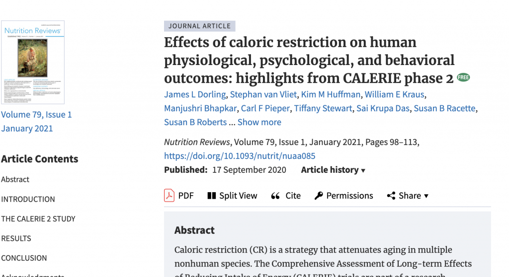
Calories:
Nutrition Reviews explored the psychological effects of caloric restriction. The research highlighted that while calorie restriction can have health benefits, it’s crucial to ensure that caloric intake remains sufficient to support mental health and prevent negative mood states.
Calories provide the body’s essential energy. Adequate calorie intake satisfies our energy needs, leading to a feeling of fullness and contentment. Steady calorie intake also helps maintain stable blood sugar, which supports emotional calmness and prevents irritability.
Inspiration:
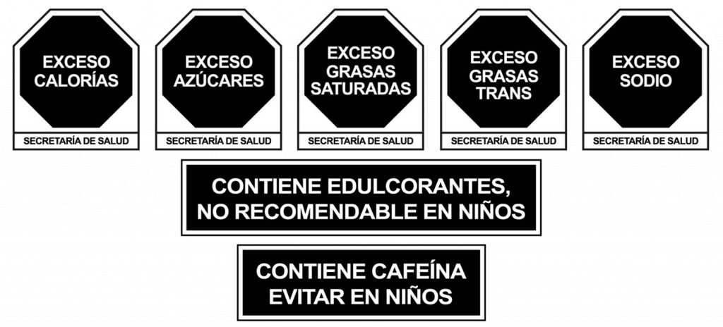
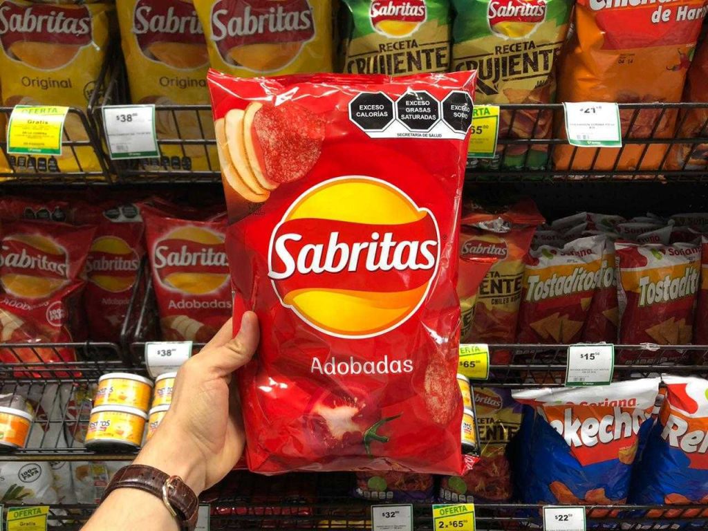
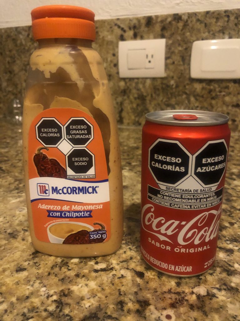
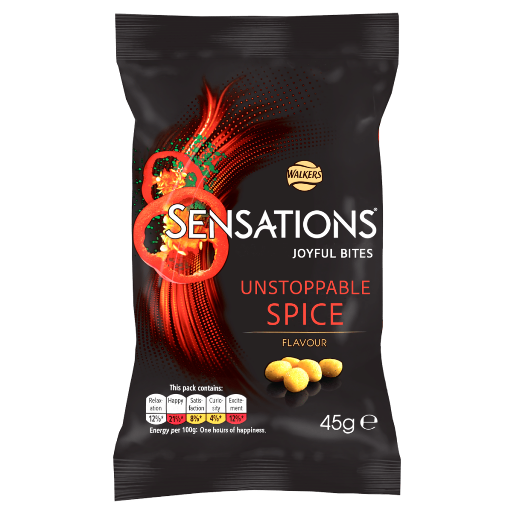
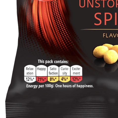
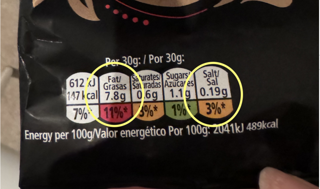
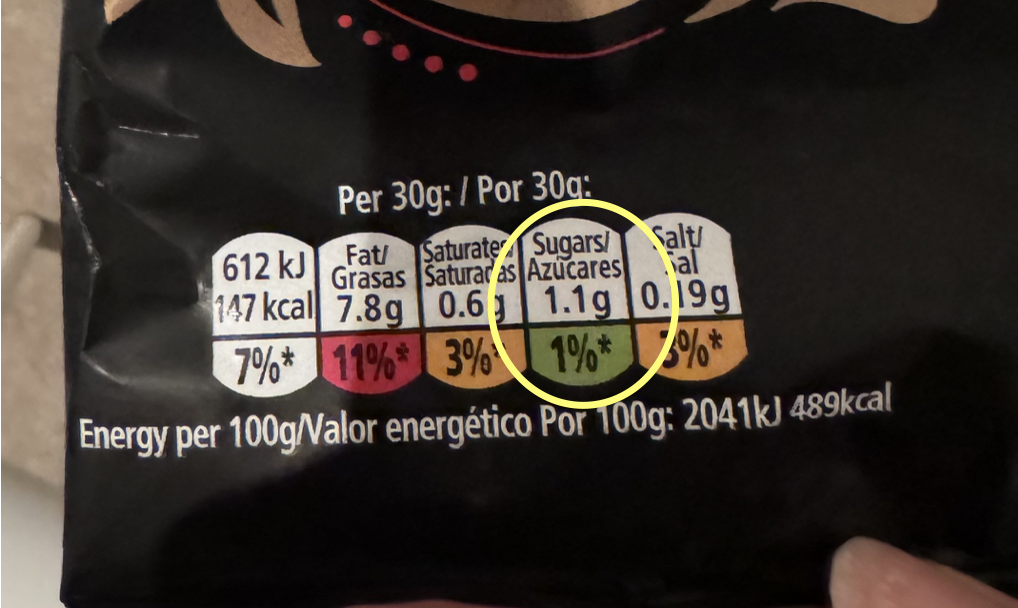
I was inspired with this presentation on the packaging. It is labelling the ingredients that are more in the ingredient list visibly for the consumer to notice. I think this is a great way to make a new logo on the package to the packaging.
From this, I thought that I could make a sticker with the logo of the emotional presentation, so that when the customer buys it, he can know what kind of psychological feeling it will probably bring to you after eating this snack. It is very interesting to translate the private emotion expression to the packaging. And the stickers also increase the interaction between the customer and the product.
In order to help sell the product, so I only show the positive emotions that I bring to my customers, and in my research, I have seen a lot of bad effects of consuming too much sugar fat salt. But because this is far from my original intention. And I hope that this label I made will help customers to increase their desire to buy for this product, so I chose not to put any negative emotions on the packaging.
Design:
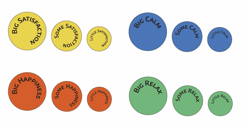
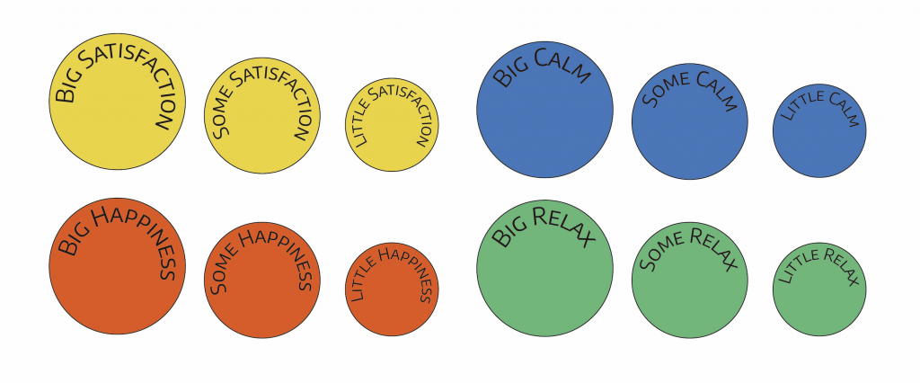
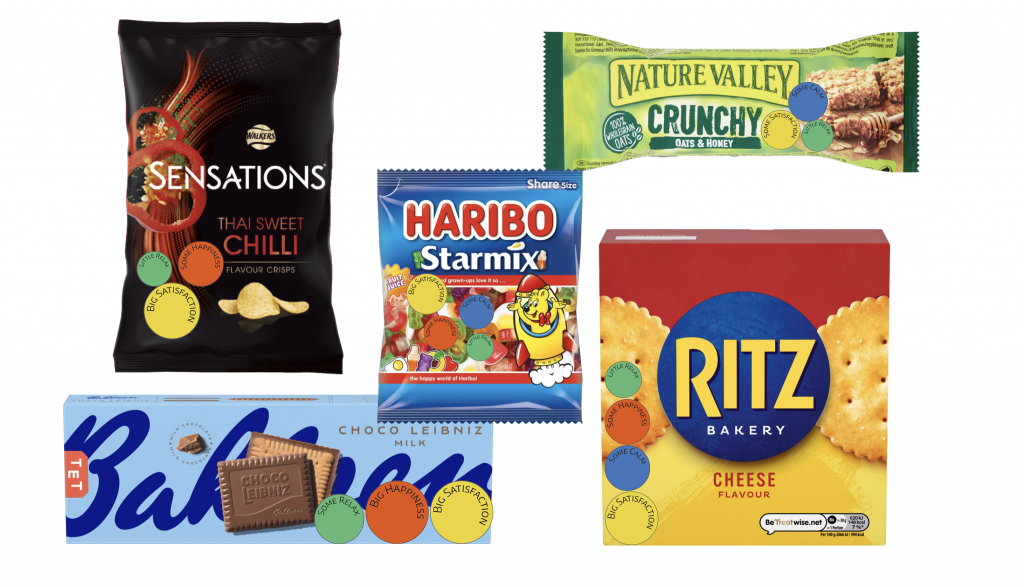
I devised four main emotions, satisfaction, calmness, happiness, and relaxation. This encompasses the positive emotions that most people feel as a result of snacking. I have also differentiated each of the snacks in terms of the degree of emotional change they bring to the person, in terms of small, medium and large.
Fine lines are rendered better.
Experiment:
Colours I also conducted research to find out which colours express the four feelings above.
To sum up, yellow can stand for SATISFACTION, blue for CALM, orange for HAPPINESS, and green for RELAX.
Big satisfaction and little relax:
High fat content, moderate salt level, and crispy texture.
The salty taste and crunch of potato chips are super satisfying, hitting that craving just right. The fat keeps you feeling full, helping you relax and enjoy the moment.
Some Happiness:
A small amount of sugar
Although it’s not a lot, it’s enough to lift the mood, as sweetness stimulates dopamine release, bringing a subtle sense of pleasure.
Based on the analysis above
This is the outcome of my emotional transformation on this bag of chips.
Then I tried to give more packages a try.
Feekback:
- Fun Factor: My emotional label idea is engaging; people said it makes them want to look at packaging labels more closely, even if they usually ignore them.
- Market Appeal: There’s a suggestion to place these emotional labels on supermarket packaging as a “marketing trick” to stimulate buying by visualizing emotions.
- Category Visualization: I could make the connection between ingredients and emotions more intuitive by visually representing ingredients (like salt and fat) rather than just using text.
- Color and Emotion Matching: Ensuring that label colors clearly match emotion categories would help users understand at a glance, and I could show how each emotion’s size relates to ingredient amounts.
- Sticker Design: People suggested creating real stickers for packages, adding interactivity and fun to the design.
- Visual Simplification: My modified nutrition facts make it easier to interpret emotions, but I could clarify how each ingredient links to a specific emotion (e.g., salt linked to a certain feeling).
- Label Details: I could replace some ingredient items with emotions directly on the list, making emotions a more integrated part of the packaging.
- Text Information: Adding more information for each ingredient category would make the emotional connections clearer.
- Font Consistency: Using the original packaging typeface and keeping font sizes consistent would help create a cohesive design.
- Increase Playfulness: Making the sticker design even more playful would enhance its appeal and interactivity, making the project more engaging.
Reflection:
Based on the feedback, I need to make the link between each ingredient and its emotion clearer. The color-emotion matching could be more intuitive, and I should keep the typeface and size more consistent with the original packaging for a cohesive look. Some ingredient labels need more detailed info, and the sticker design could be even more playful to boost its appeal and interactivity.
To develop this project further, I could make the emotion-ingredient links clearer, improve color matching, and add more detailed info for each ingredient. I also learned the importance of consistency in design, like using the same typeface and size, and how adding playfulness can make a project more engaging. This will help me create clearer, more cohesive, and interactive designs in future projects.
Written response
Leave a Reply