
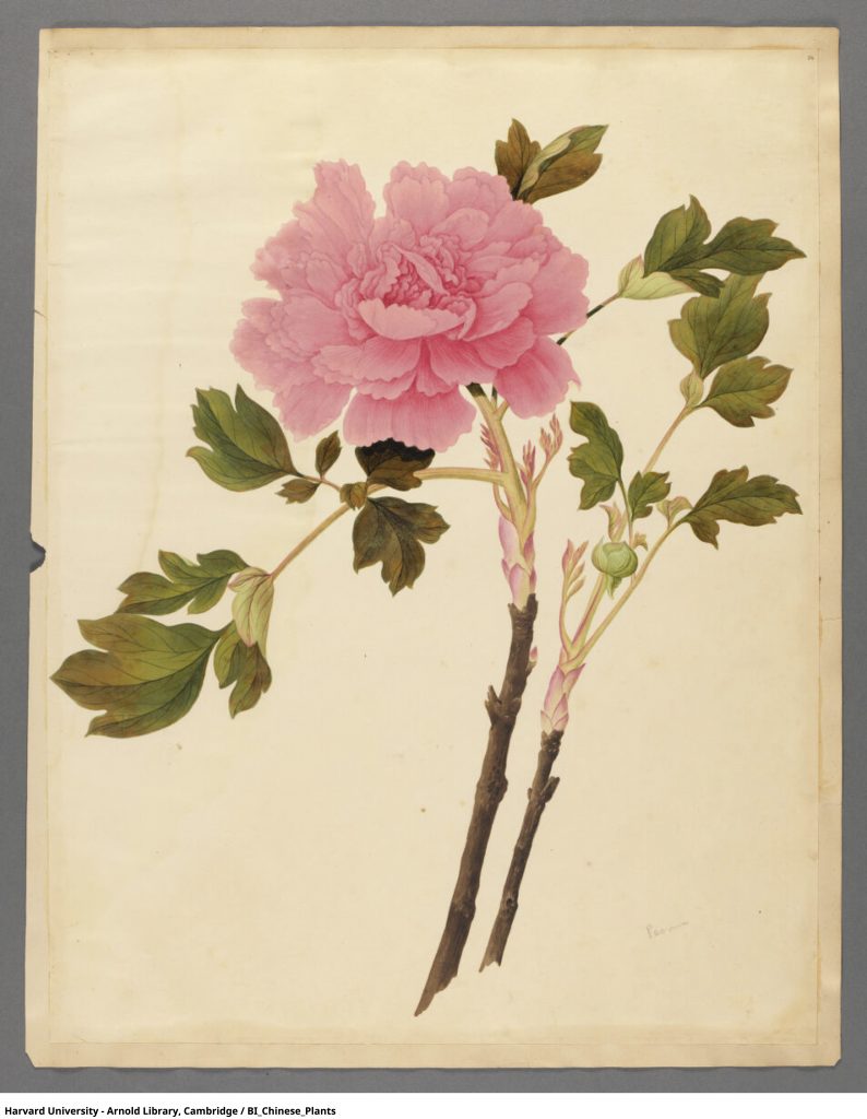
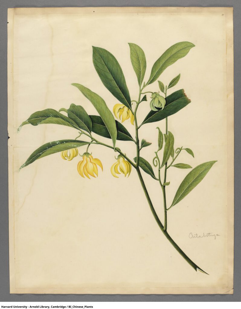
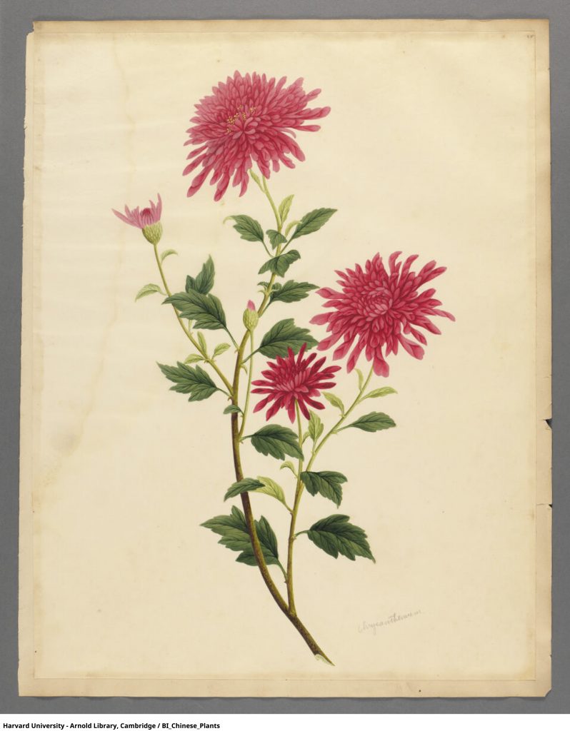

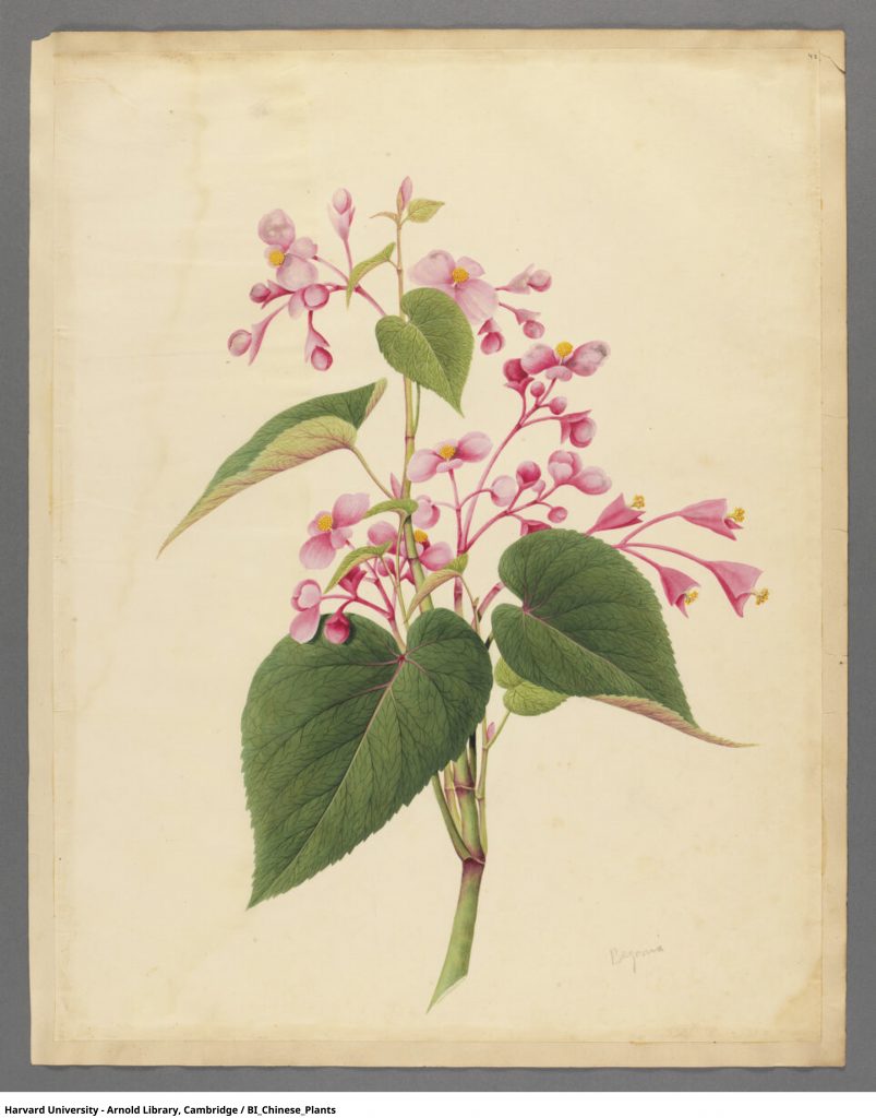
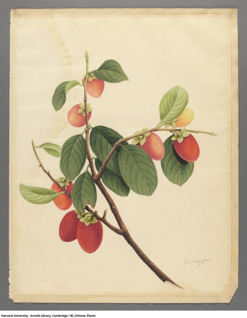
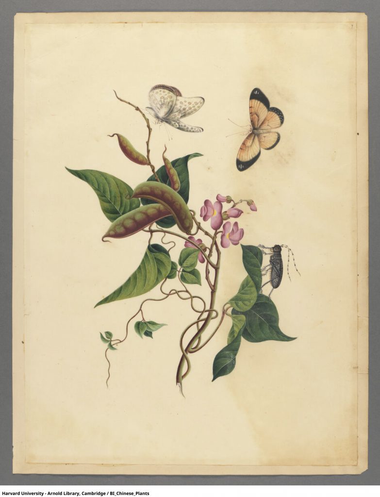
3 New method of cataloguing
- Taxonomical(seasonal blooming periods)
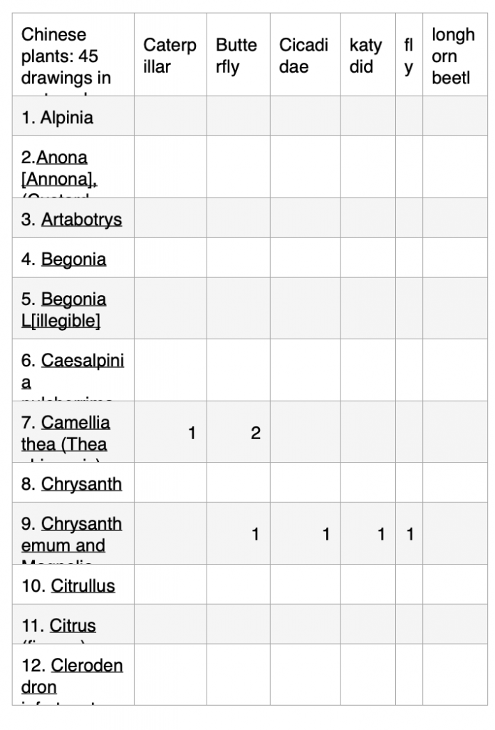
- Framing + Classifying(Calculate and identify the presence of insects)
- Recontextualizing(Different symbolic meanings in Chinese culture)
Taxonomical
(seasonal blooming periods)
Research:
Classified:
Instead of just relying on the visual representations in the paintings, I am delving deeper into the biological behaviors of the plants.

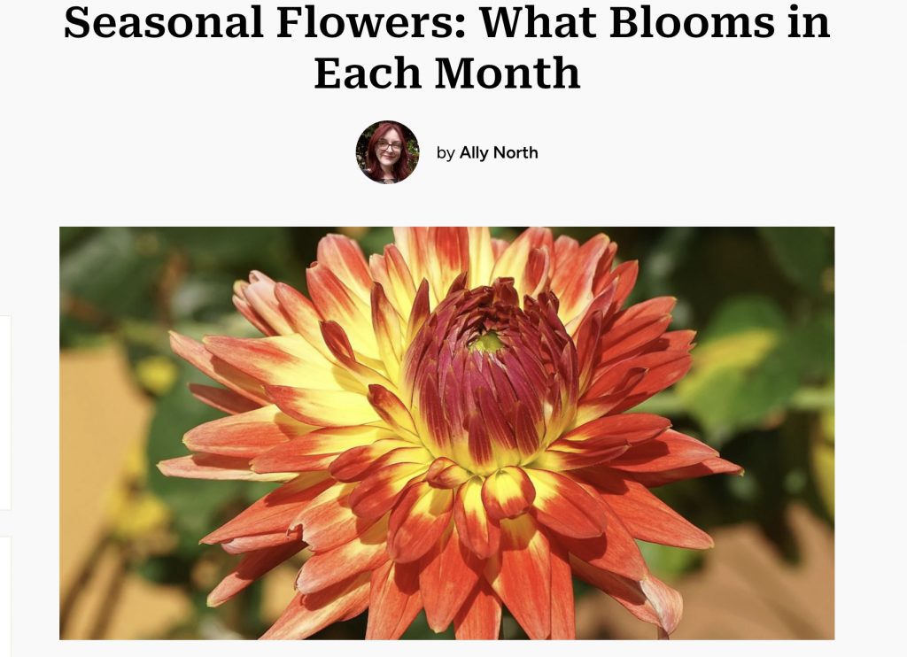
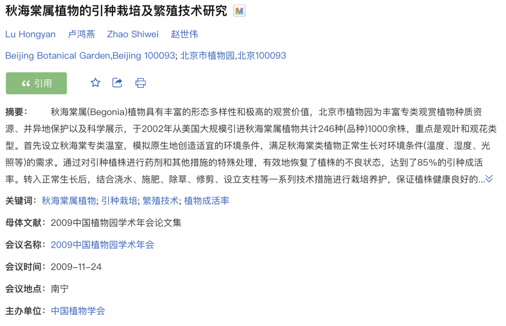
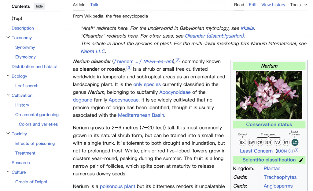
Spring (March – May):
- Begonia
- Camellia thea
- Chrysanthemum and Magnolia
- Gardenia florida
- Hibiscus rosa-sinensis
- Lagerstroemia
- Magnolia liliflora
- Magnolia denudata
- Prunus
Autumn (September – November):
- Chrysanthemum
- Citrullus
- Citrus (fingers)
- Diospyros kaki
- Myrica rubra
- Vitis
- Hypericum
Multiple Seasons or Year-Round:
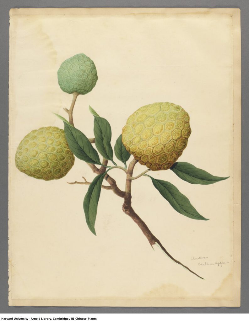
- Annona
- Clerodendron infortunatum
- Artabotrys
- Bletilla sinensis
- Enkianthus sp.
Summer (June – August):
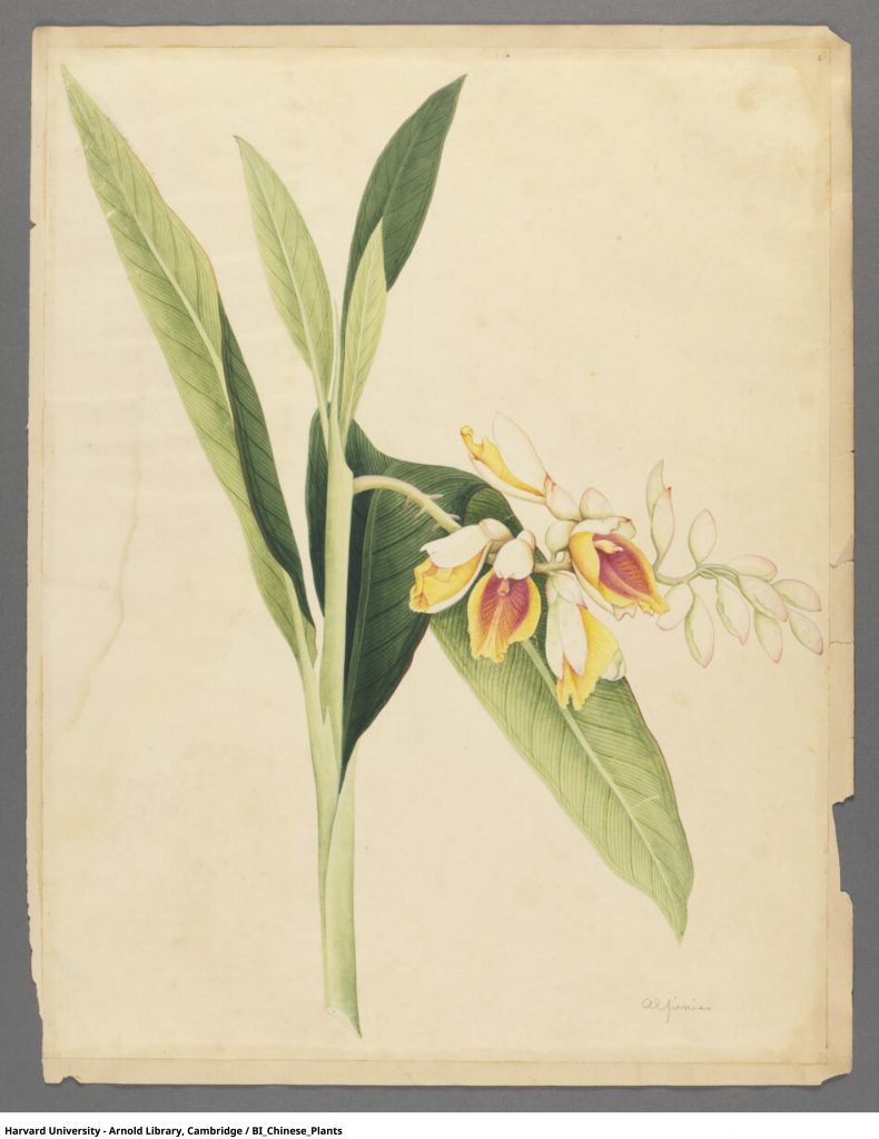
- Alpinia
- Caesalpinia pulcherrima
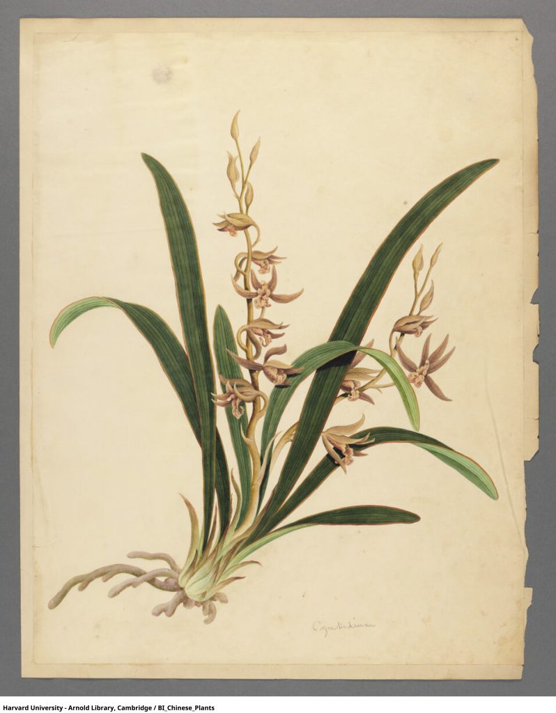
- Cymbidium
- Nelumbium
- Lantana
- Lycoris aurea
- Nerium
- Psidium guajava
- Rosa
Winter (December – February):
- Iris
- Peonia (Paeonia)
- Mirabilis
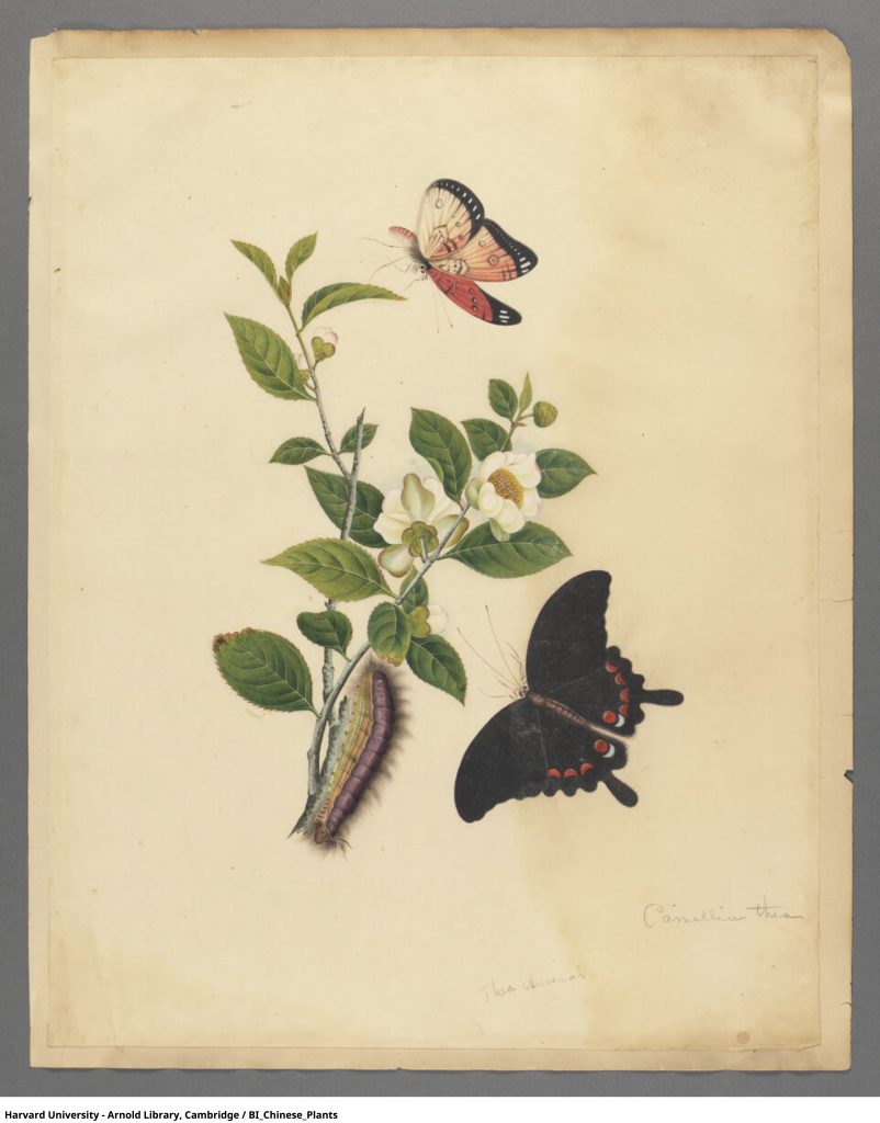
- Thea
- Lan wahr?
This deeper classification emphasizes the botanical characteristics of the plants, giving a clearer understanding of their role in nature.
Framing + Classifying
(Calculate and identify the presence of insects)
Framing:
Classified:
By analyzing the presence of insects in the paintings, I’m introducing a new lens through which the artwork can be understood.
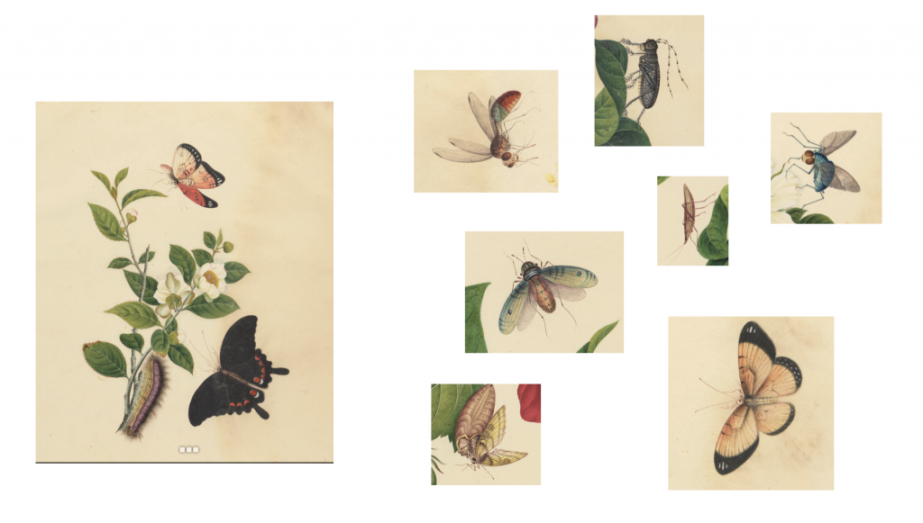
It shifts the viewer’s focus from purely appreciating the beauty of the flowers to understanding their role within a broader ecological context.
Recontextualizing
(Different symbolic meanings in Chinese culture)
Research:
Symbolic meanings:
I’m shifting the focus from the purely scientific or natural context to cultural interpretations.

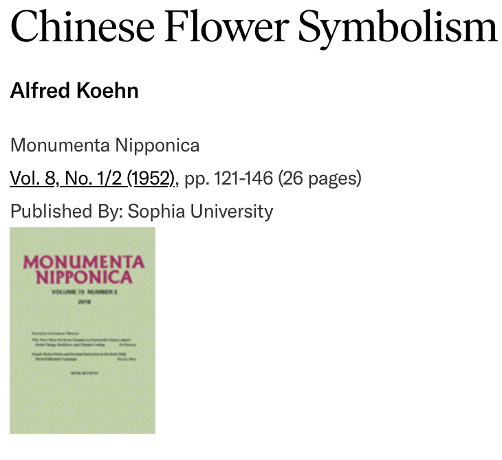
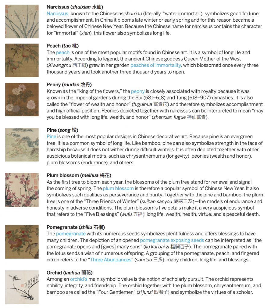
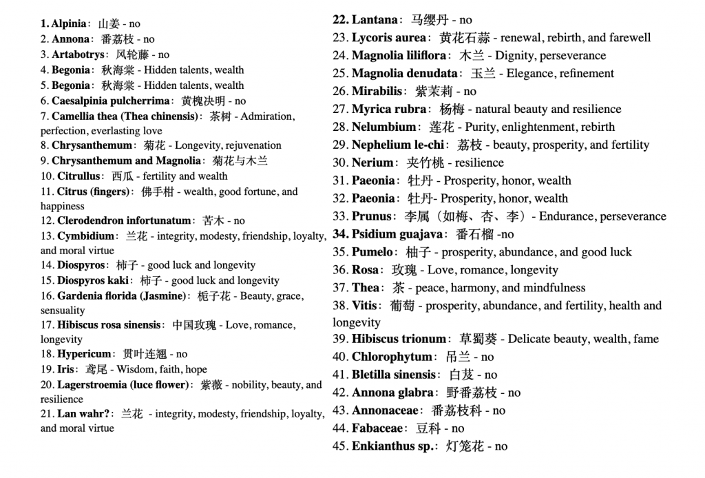
This change in context allows you to explore deeper cultural meanings and relationships.
Further Development
Recontextualizing
(Different symbolic meanings in Chinese culture)
Based on similar meanings in Chinese culture, the classification:
Collage:
Research and experiment:
Wealth, Prosperity, and Abundance:
Experiment:
Longevity:
Experiment:
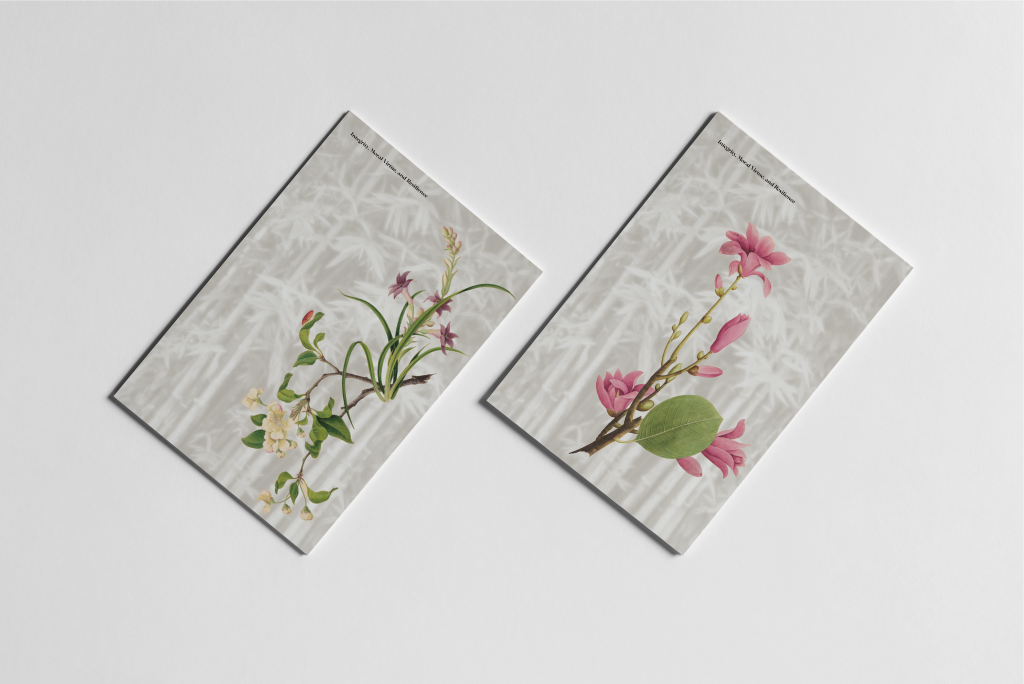
Integrity and Resilience:
Experiment:
Purity and Enlightenment:
Experiment:
Beauty, Grace, and Sensuality:
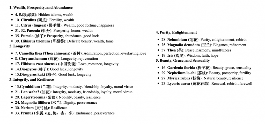


Research on how each category can be presented. Experiment to determine the feasibility of this method or element.
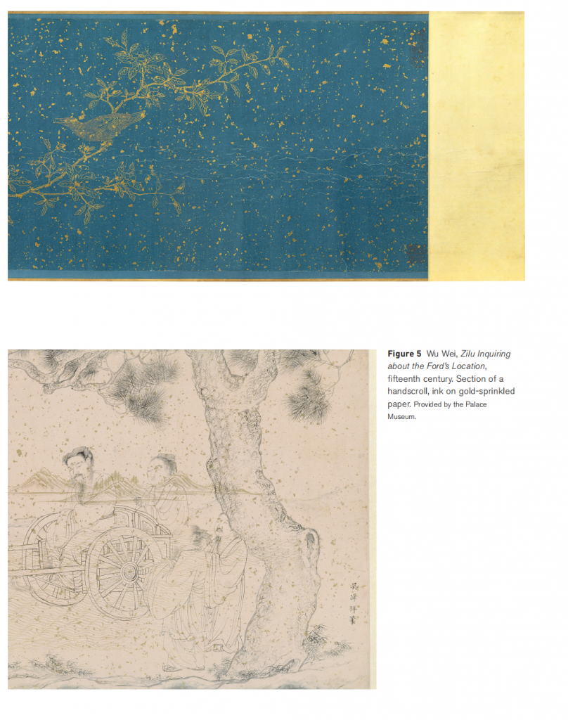
In traditional Chinese art, the 洒金 (gold sprinkling) technique is all about symbolizing wealth, abundance, and lasting success. Gold itself has a natural association with high value, prestige, and resilience. In Chinese culture, it represents a type of wealth that doesn’t just shine but also endures over time, hinting at lasting prosperity and an unbreakable legacy that can be passed down through generations. When artists use gold in paintings, scrolls, or ceramics, it’s more than just decoration; it’s a way of imbuing the piece with good fortune and blessings of success for those who own or display it. In imperial households, where gold-laced items were common, this technique helped convey status and attract positive energy, believed to bring stability and prosperity to the family for years to come.


I experimented with creating the 洒金 (gold sprinkling) effect myself. First, I tried using gold powder with a brush, sweeping it gently and even flicking the bristles to get a scattered effect. Then, I experimented with using gold leaf by applying small pieces to add a more solid shimmer. Each method gave a different texture and level of shine!
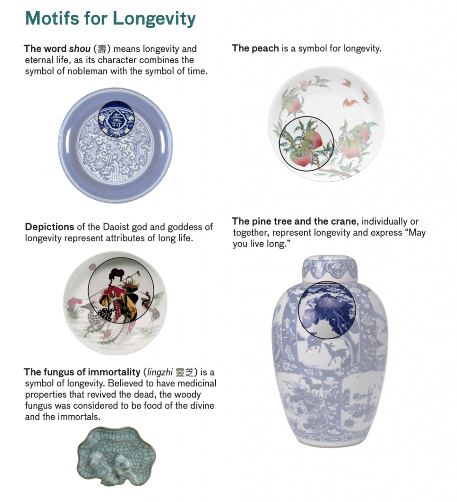
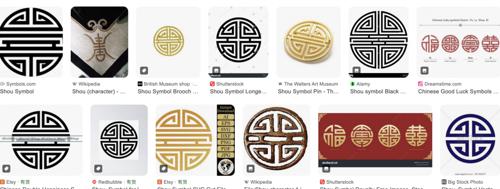
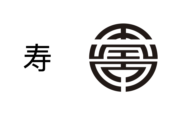
Through researching traditional Chinese painting and representations of longevity in Chinese culture, I want to focus primarily on the Chinese character “寿” (longevity) as a central element. Since longevity often appears as a symbol in Chinese visual culture, I also aim to design a unique emblem representing longevity. This emblem will then be integrated into the floral designs.
I tried to symbolise the Chinese character for ‘寿’.
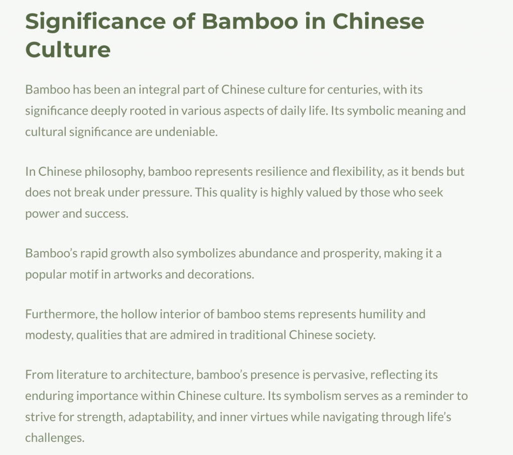

Therefore, I want to incorporate bamboo elements into the card to highlight their shared symbolic meaning in Chinese culture.
I found a photograph of bamboo and explored ways to integrate it with the flowers. I discovered that using it as a background was effective; it allows the bamboo to be visible without overshadowing the flowers as the main focus. I chose to adjust the image to a single color tone and reduce its saturation to make it less attention-grabbing. I also added a soft glow to give a gentle effect, and finally, lowered the transparency to achieve a suitable background effect.


Negative space:
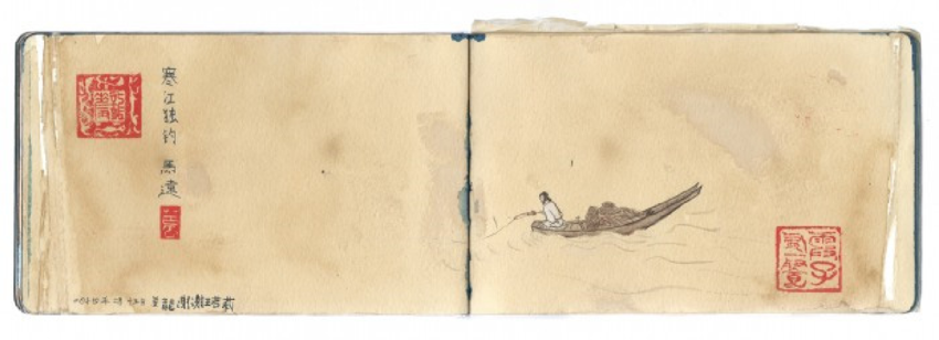
In the painting, a single fisherman sits in a tiny boat surrounded by empty space. A strong sense of solitude and resilience.
I considered how to convey negative space and decided to present each plant individually, as this approach better represents purity. I primarily used white to emphasize this sense of purity.
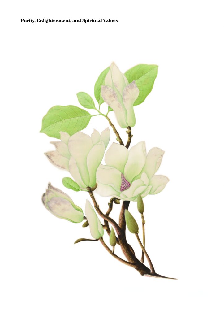

However, I felt that using only white would make the design rather dull, so I decided not to rely solely on white. Adding color contrast might better highlight the sense of purity that white conveys. Therefore, I ultimately presented the final form in this way.
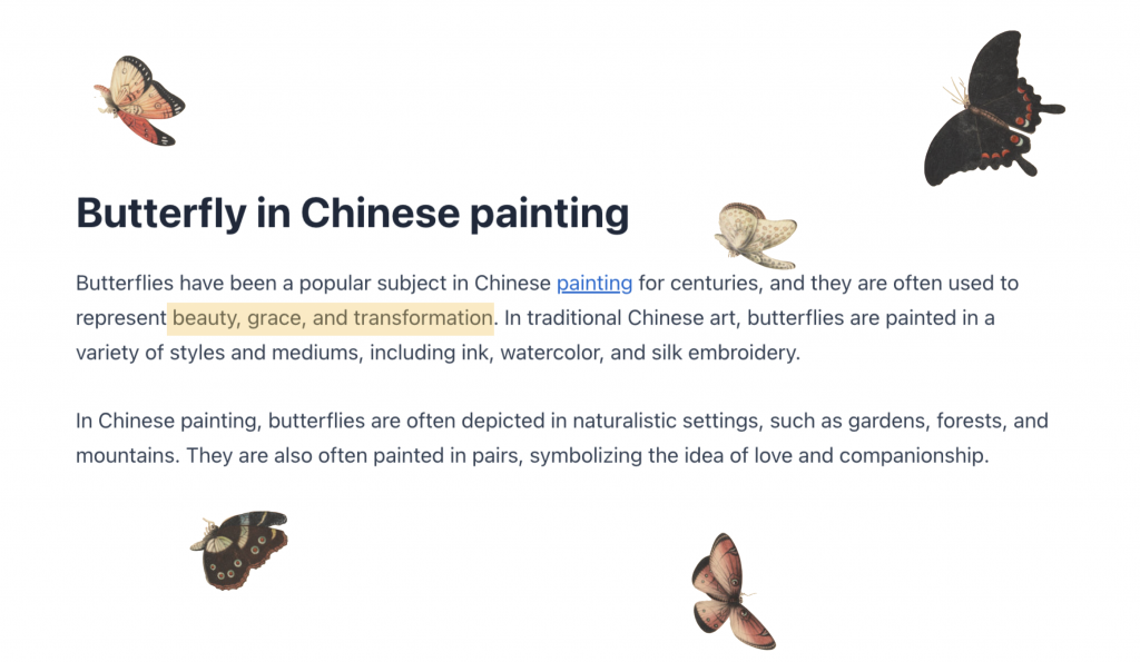
Through my research, I found that butterflies are commonly used in Chinese paintings to represent beauty and elegance. Therefore, I plan to incorporate butterflies with the flowers to convey the symbolic meaning of beauty in Chinese culture.
Moreover, in this archive, there are already some illustrations where flowers are depicted together with butterflies. So, I extracted these butterflies and collaged them with the flowers that symbolize beauty. The overall composition achieved a very cohesive visual effect.
Outcome:
Integrity and Resilience:
Longevity:
Purity and Enlightenment:
Wealth, Prosperity, and Abundance:
Beauty, Grace, and Sensuality:



Feedback
- Consistency in Visual Style: There were some inconsistencies in style, as certain elements appeared to come from different sources or archives. This affected the visual harmony of the project, especially in sections like Integrity and Resilience, where the bamboo background felt out of place compared to the watercolor style of the other elements. Keeping a unified visual style across all elements would strengthen cohesion.
- Purity Theme Execution: The Purity section was noted as visually less engaging compared to other themes. The layout and design choices for this section may need to be revisited to avoid a dull presentation, potentially by introducing more creative or symbolic elements beyond negative space.
- Unified Source for Elements: It was suggested that if all design elements came from a single archive or were adapted to appear as though they did, the overall project would feel more cohesive. This would avoid any stylistic discrepancies that arise from mixing sources.
- Symbol Integration: For elements like Longevity, it was recommended to incorporate traditional Chinese calligraphy or patterns directly, which might create a more harmonious blend of cultural symbols and aesthetic elements.
Reflection
This project provided valuable insights, though time constraints limited my ability to experiment deeply. With more time, I would have explored additional methods, such as testing different cultural symbols and styles, to enhance the connection between Chinese symbolism and the themes of wealth, longevity, and resilience.
Feedback emphasized the need for visual consistency, especially in areas like the Integrity and Resilience section, where mixed styles felt mismatched. Incorporating elements like traditional calligraphy for Longevity could have improved cultural depth and coherence.
This experience taught me the importance of cohesive aesthetics and the power of recontextualizing traditional symbols for modern, meaningful visuals. I also learned to methodically organize visual elements, a skill I can apply to branding, layouts, and narrative design. Moving forward, I’ll focus on creating visually unified and culturally rich designs, building on the lessons from this project.

Leave a Reply